Suzuki Victoris: When Form Loses Its Logic
- Niwwrd

- Oct 17, 2025
- 3 min read

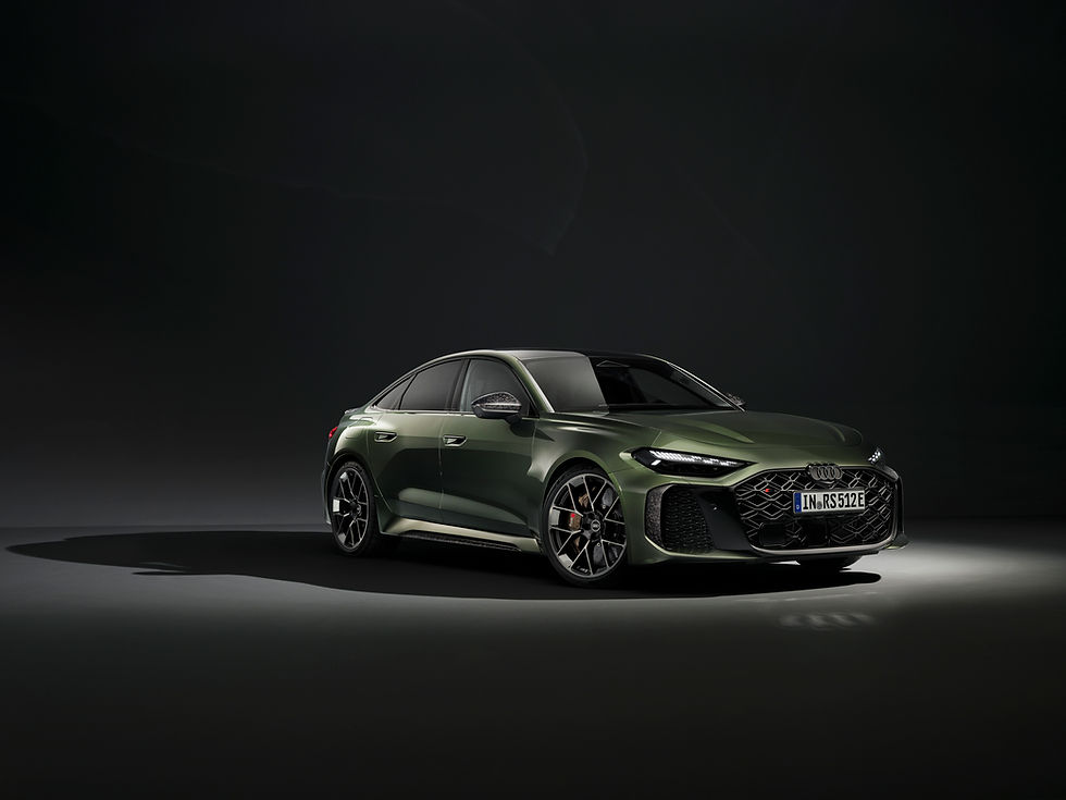
Suzuki’s Victoris arrives as a statement product meant to show that the company can move beyond safe, functional design and express confidence through form. It sits on the Global C platform, sharing engineering DNA with the Grand Vitara, yet aims to carry a distinct visual identity.
From an industrial design standpoint, the Victoris is an interesting case. The engineering is solid, the stance is correct, and the interior is well resolved. But the visual composition, especially at the rear, reveals a clear gap between design intent and execution.
Design Philosophy and Proportion
The Victoris starts strong. The front establishes a bold, grounded presence. The shoulder line defines the body tension, the surfacing feels clean, and the geometry of the front fenders gives it a well-contained mass. The silhouette has proportion, the glasshouse tapers neatly, and the body-to-glass ratio feels balanced.
Up to this point, the design discipline is visible. It speaks the language of restraint and structural clarity, qualities often missing from mass-market SUVs. However, this discipline breaks down the moment you move to the back.


The Rear Design Problem
The Victoris’ rear is its biggest letdown. The tail section looks like three design ideas mashed into one. The light bar tries to imitate a high-tech aesthetic, but the execution feels disconnected from the overall form. The angular cuts and oversized elements make the back appear bulky and unresolved, breaking the visual balance the side and front manage to build.
Where brands like Kia or Hyundai find harmony between surfaces and lighting, Suzuki’s rear design here feels forced and overly styled. It lacks that sense of flow and proportion expected in modern SUV design. The details, especially the taillight cluster, could have been simplified to better complement the body volume. Even small refinements like cleaner light integration or a stronger bumper definition could have saved it from looking clumsy.


Understanding Why It Fails
Design failures often reveal themselves not through what is added, but what is lost. In the Victoris, the transition from the side surface to the tailgate breaks continuity. The light bar cuts across a high shoulder line without any visual anchoring, creating tension rather than movement. The taillamps are overemphasised, visually lifting the mass upward, which makes the rear look heavy on top and hollow below.
The bumper tries to counter that weight with exaggerated chamfers and a protruding blacked-out diffuser. The result is a rear that neither grounds the car nor relates to the front’s measured geometry. It is design noise.
What makes it worse is that the rest of the car shows promise. The stance, proportion, and surfacing are all correct, but the rear abandons the design logic established by those surfaces. It feels as if multiple designers worked independently without a final refinement loop to unify their intentions.
Comparative Design Context
This issue becomes clearer when placed beside its rivals.The Kia Seltos uses a disciplined light structure that feels integrated into the surface flow.The Hyundai Creta maintains visual hierarchy, allowing taillights and bumper to follow body volume rather than compete with it.Even Tata’s Curvv concept, more expressive and sculptural, controls its graphics to serve the mass.
The Victoris, however, feels like an experiment that lost confidence halfway. It chases visual drama but forgets proportion, one of the most fundamental principles of automotive design.
Interior and Design Continuity
The interior follows a different approach that is rational, structured, and material-efficient.Its horizontal layering, clean instrument panel, and clear ergonomics show Suzuki’s growing maturity in user-centered design. While not adventurous, it is cohesive. It reflects the engineering discipline that the rear exterior lacks.
The contrast between the interior’s logic and the rear’s visual chaos highlights the gap between design engineering and design storytelling. The car’s structure communicates precision, while its body fails to express that intelligence.


Conclusion
The Suzuki Victoris is a car with good bones but a confused form. It proves that strong engineering cannot compensate for poor visual coherence. The rear, instead of concluding the design with confidence, unravels the logic that defines the rest of the vehicle.
For a brand like Suzuki, which is steadily improving its design maturity, the Victoris should have been a defining step forward. Instead, it becomes a reminder that progress in design comes from restraint, not complexity.
The Victoris is mechanically sound, proportionally balanced, and functionally capable, but visually inconsistent. It is a car with a strong soul held back by one of the most unresolved rears in its class.
If Suzuki wants to move toward design leadership, it must not only engineer better cars but also ensure that its forms finish as confidently as they begin.


Comments